Data Cleaning, Analysis, and Visualization.
This is an examination of the process of how I personally analyze and clean data, as an example I’ll be using the visualizations from my Data User Guide. I would recommend reading that post first for an extensive overview of the data and visualizations, this post should serve as explaining my methodology.
This is two images of the HIP Retailers Dataset, collected by Metropolitan Area Planning Council. The second image should make clear there was a trend in multiple blanks in the column listing phone numbers for multiple farms and farmers markets. Now that could be attributed not to error on MAPC’s part but simply multiple farms not providing that information or simply not having a central phone number. But through both filtering the data through OpenRefine and manually tallying all 424 data points on paper, I found 240 of the listed farms did not have numbers, that’s 56 percent of the data.
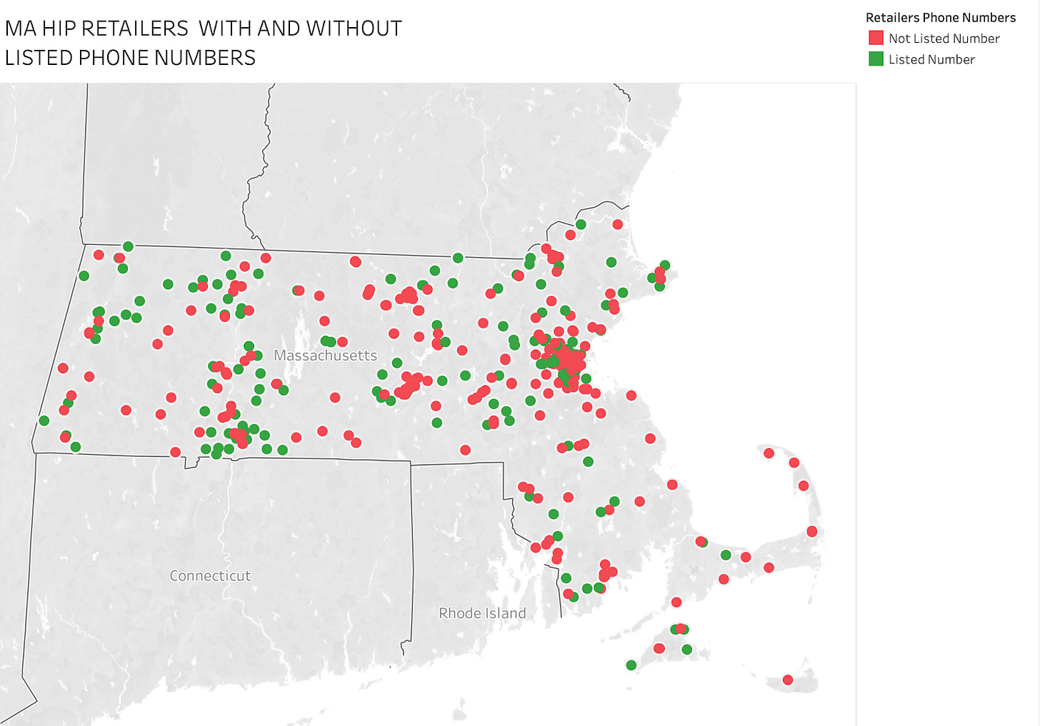
I go into more detail in the User Guide, but having over half your data without listed contact information was a factoid I needed to visualize. I figured the most effective visualization then showing the areas which there was a consistent lack of phone numbers. In Tableau, I was about to plot all the points but sorting them by color was the real challenge more than visualizing them. At first the listed phone numbers be manually grouped together, Tableau originally thought each individual phone number was a group. But I was able to group them into two groups “Listed Number” and “Not Listed Number” and below you can see the before and after of this process.
Before:
After:
As for the colors themselves, I had debates over avoiding the red and green as they were holiday colors, but I found the way the red overwhelms the map as effective in showing which areas in the dataset were lacking listed numbers. Both overlapping and separating the data show make it clear where the gaps are. This has been an unofficial methodology of how I visualized the data from my earlier project.


