Creating Charts of Greenhouse Gas Emissions
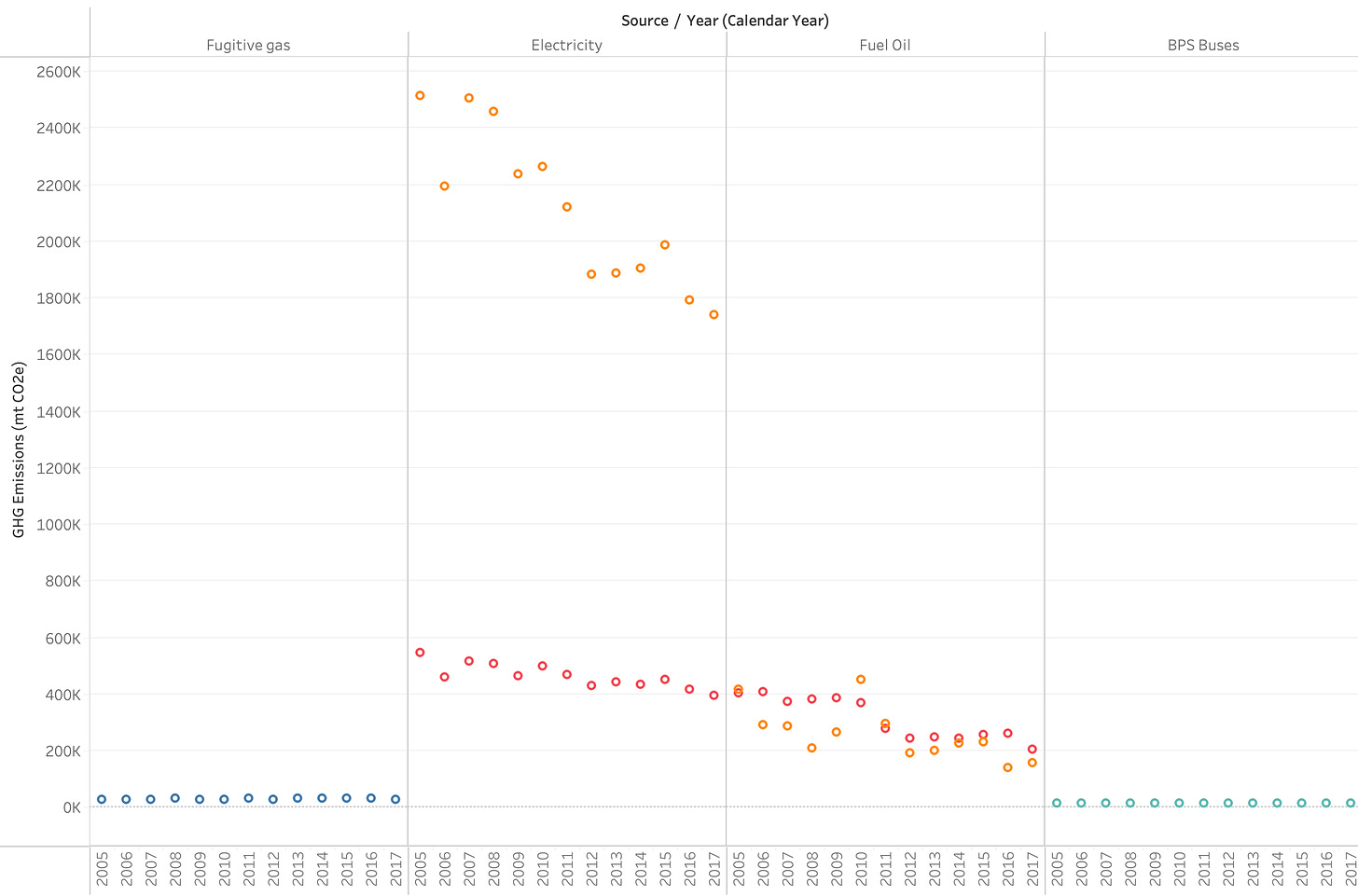
Working with this data was a process of figuring out what story it was trying to tell. When I realized it was data for multiple different sectors across a few years, the best visualization felt like a timeline. I first tried to present them as small circles for each year, data points moving across the timeline, but considering the amount and variety of data it looked cluttered and confusing.
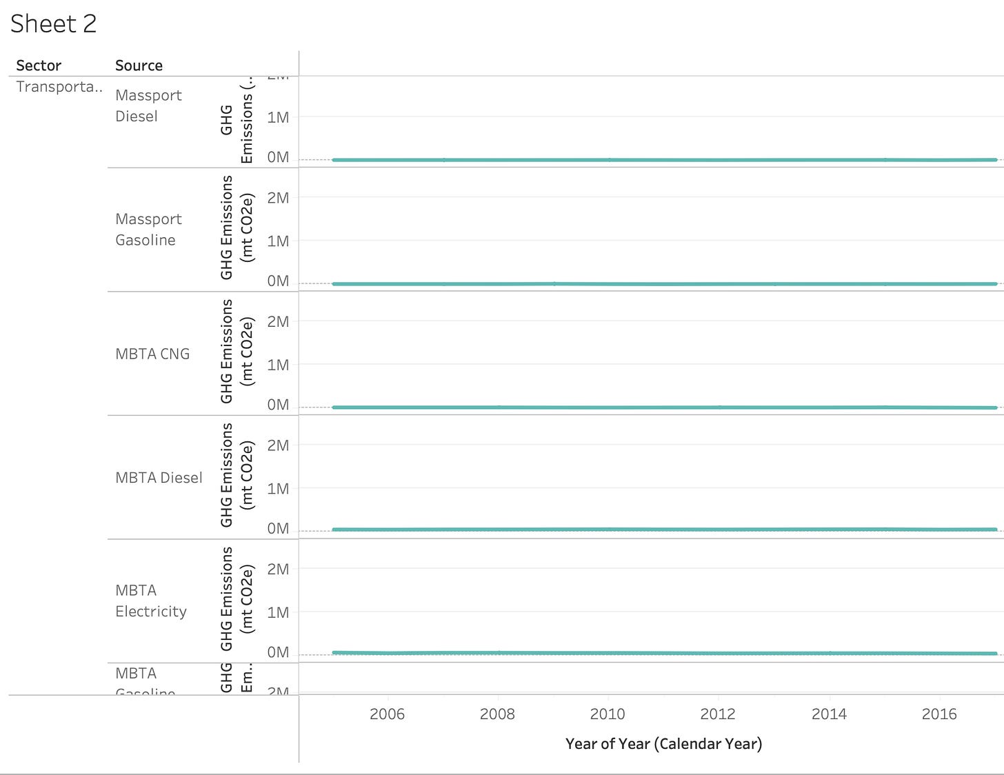
An issue that popped up in that last image and the next one is the Y-axis. Because this dataset covered emissions from multiple sectors (Transportation, Residential, Commercial, Waste) and sources (Gasoline, Electricity, Oil, Diesel, Steam). So the Y-Axis was determined by the highest source, Residential electricity, which was in the millions while others were in the thousands. As you can see that makes the timeline look very flat and static for most of the sectors.
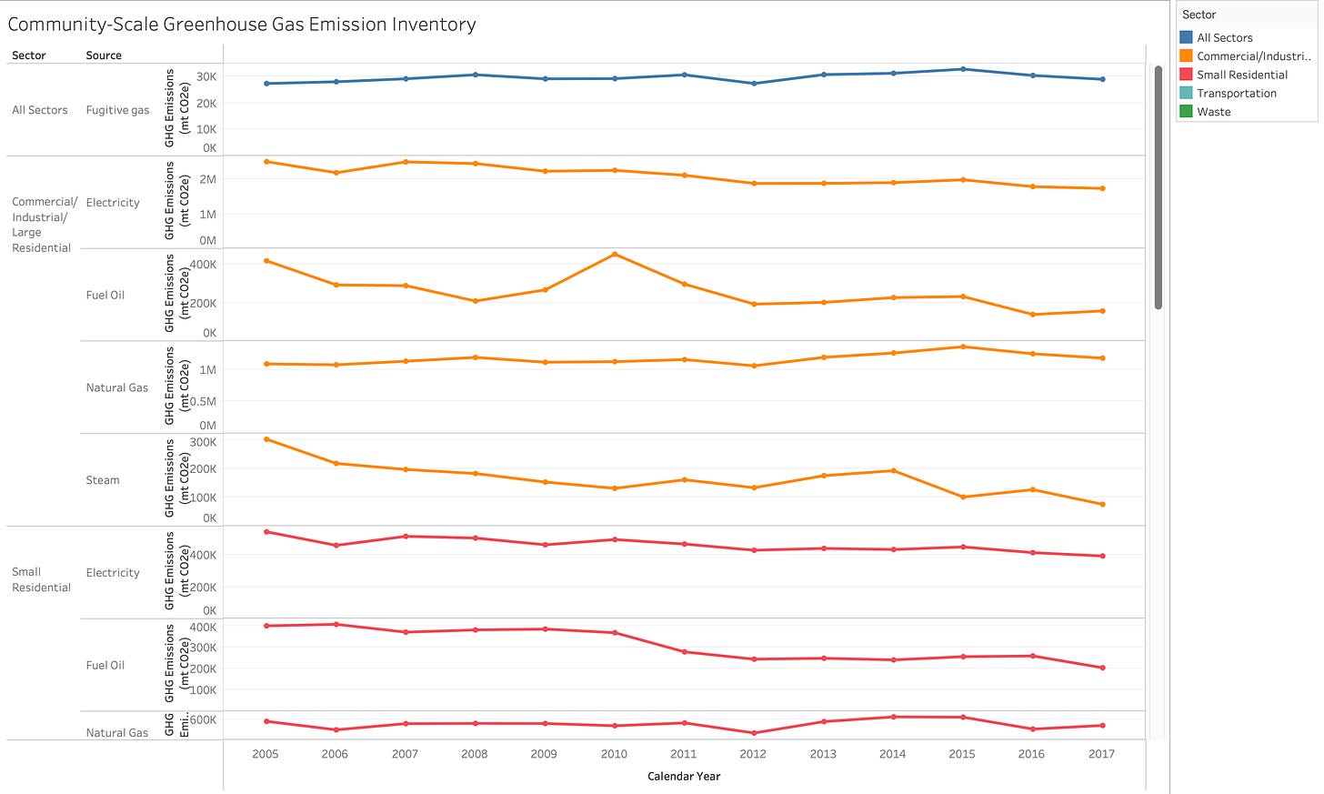
But once I found out in Tableau you can just adjust the Y-Axis to be dependent on each category, it made a much more cleaner line graph you can see at the top. Along with adding a distinct color key to make reading each sector easier, I added dots for each year to provide a quick pop-up if one wanted to know say, the exact number of emissions Commercial Steam produced in 2009.
With clearly defined peaks and drops, the data can lead to questions which turn into stories. Why did Massport CNG fuel emissions suddenly drop by 10,000 between 2008 and 2010? Why has the use of Steam in Residential areas been on a steady decline? How can transportation emissions be higher than small residential emissions in certain areas like vehicle fuel? I could not have asked these questions just staring at the emission amounts and dates before, visualization organizes data to provide patterns for both author and reader to pick up on.


